Inkbrook Design: The Portfolio of Mackenzie Cameron
Resume | Portfolio | About Me |

After the launch of the MVP Bullhorn Mobile App, we wanted to identify and develop priorities that would have the biggest impact for our users within the immediate roadmap.
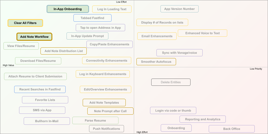
I worked with a Product Manager and Product Owner and identified three usability improvements that would have a strong impact on our users that could be implemented swiftly with a low level effort.
We developed a first time user tutorial, improvements to filtering on lists, and a workflow improvement.
I spearheaded our research efforts to ensure a clear picture of our users. We ran a targeted email survey, analyzed 250+ responses, and followed up with over a dozen qualitative interviews. The results gave us a broad picture of our users.
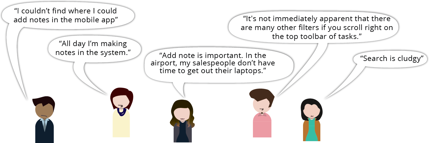
Our users listed a remarkable number of pain points and features as high priority. Through affinity mapping and discussion we were able to consolidate our many responses into understandable trends. Through interviews with users we were able to find a root cause for many of those trends.
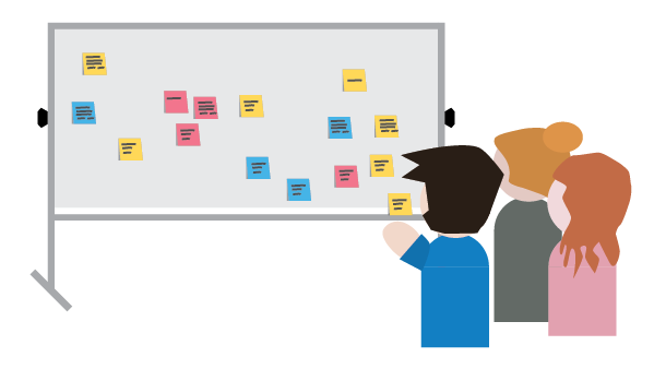
I led multiple design studios with the team: myself, the product manager, the product owner, and a couple developers. Using our research, we sketched out over 30 initiatives and rated them by level of effort and customer impact.
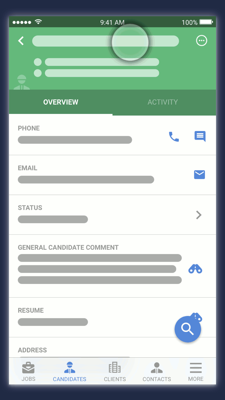
In our research, many respondents asked for features that had in fact already been implemented. To help with the discoverability of many features I built a number of animations in Principle that could be surfaced to users the first time they logged into the app. We focused on three specific areas where users had raised the most concerns.
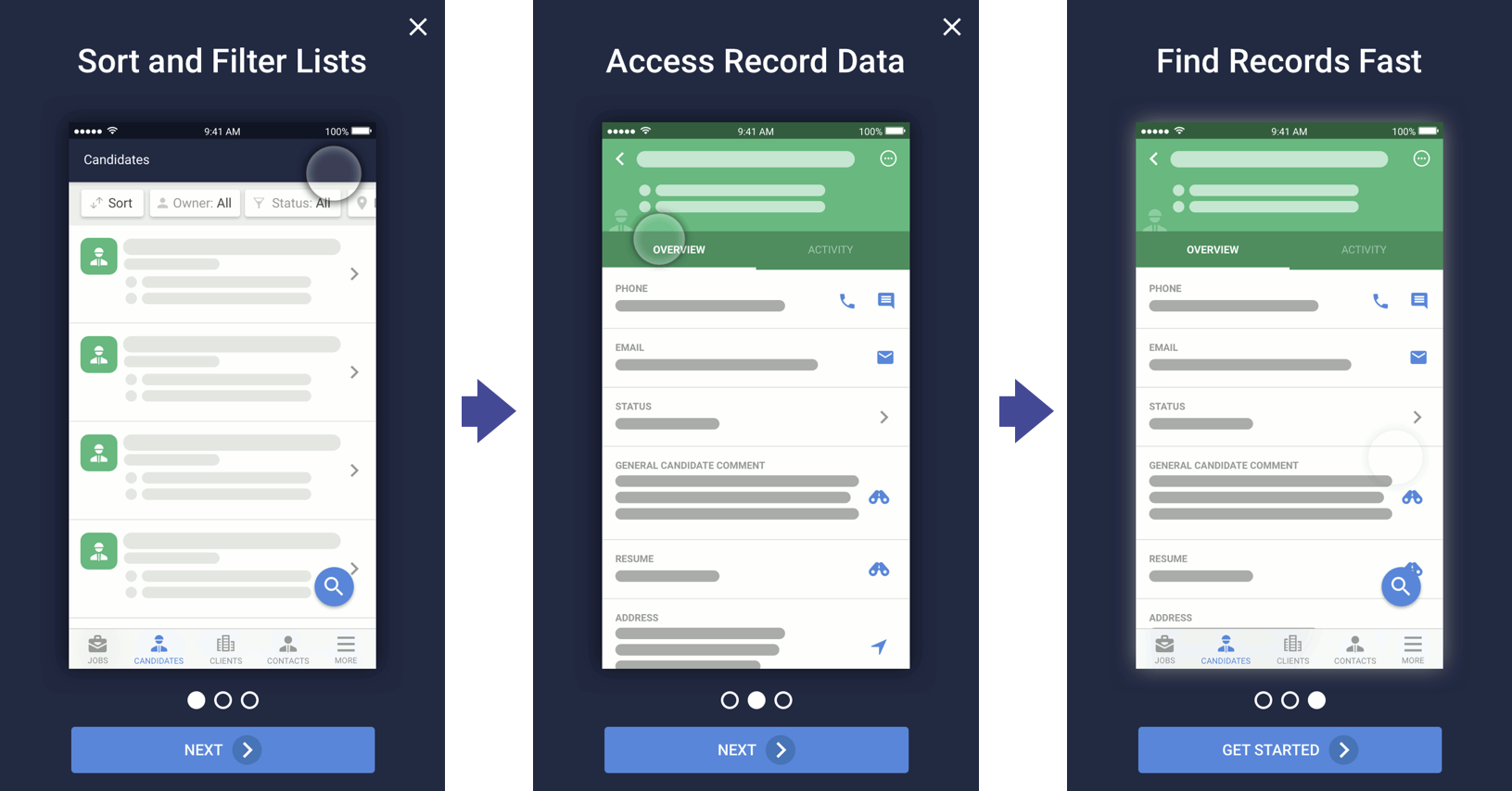
It was important that the animations quickly convey simple concepts and set baseline context for what the user should expect to find. Things like horizontal scroll on filters and where to find record level actions.
We built the feature so that new animations could be input on specific app updates, and we placed the animations into our support documentation.
I iterated several attempts and kept the animations simple, using a spyglass and drop shadows to denote gestures. Slight easing to helped make the motion feel human.
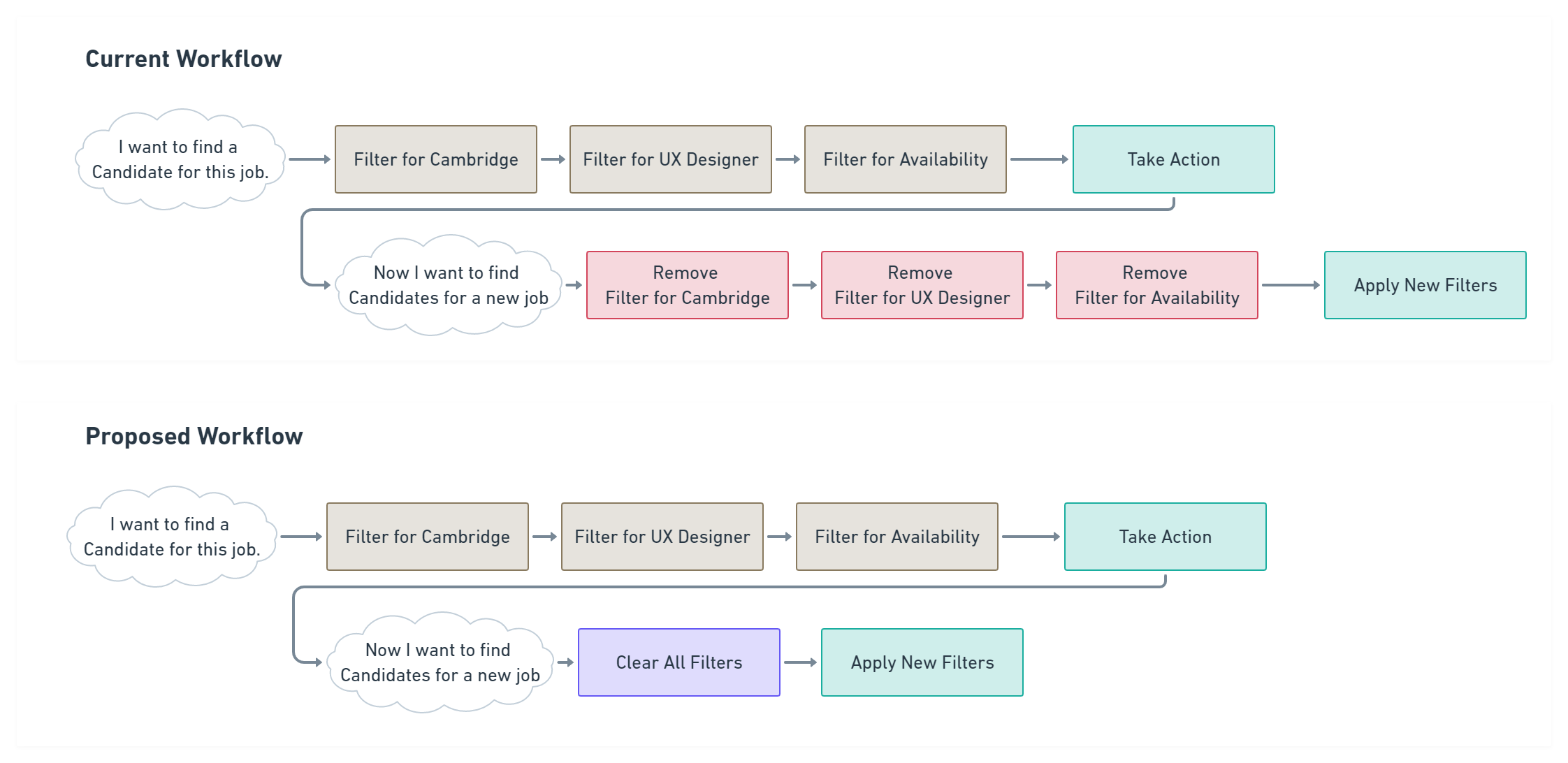
Many users articulated a pain point when filtering lists of records. When searching for a specific task they would apply upwards of 6 or 7 filters, when they moved onto the next task they would want a totally separate set of filters. This required that they remove each filter individually, which became a common pain point.
I led a handful of UX designers through exercises looking at common "clear all filter" paradigms on apps and, from that discussion, developed a variety of possible solutions. After a little bit of testing, we landed on a style that was both clearly present and allowed visual space for us to support the workflow with a "filtered results" count.
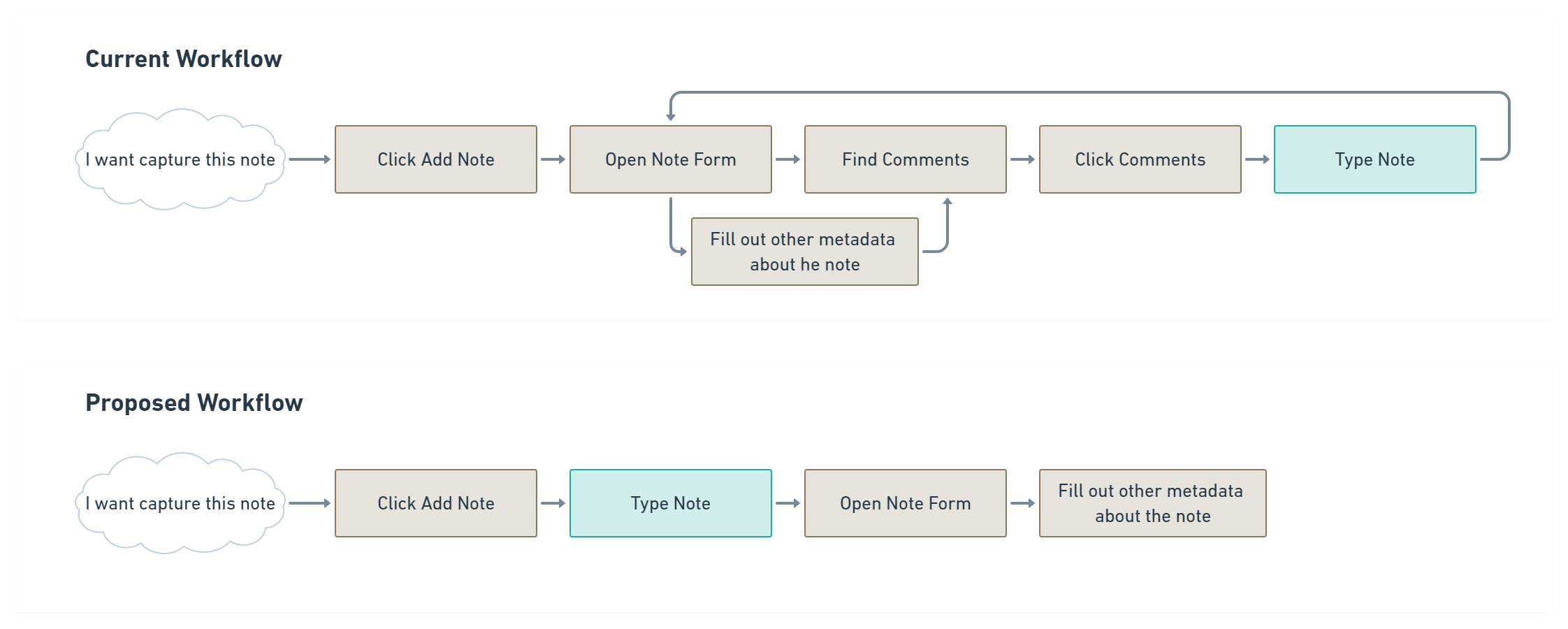
From our survey and interviews, users mentioned the importance of adding notes twice as often as any other feature. Many users mentioned that the used the mobile app exclusively to add notes. Consequently, we also heard feedback that adding notes was "clunky" or "slow".
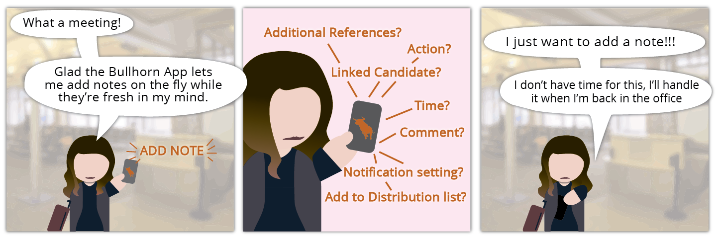
Though the initial add note workflow mirrored roughly the form from the desktop app, but we came to understand that mobile usage necessitated a different flow. Notes can have a lot of metadata added to them, but it's a much lower priority on mobile than it is on desktop.
These three features were able to fit nicely into the crowded mobile roadmap, and were able to address wide swaths of our users concerns. As we continued soliciting feedback from our mobile customers we began to receive a more positive trend of responses following implementation of these features.
The research and validation of these initiatives helped pave the road for future enhancements, and allowed us to feel confident in pursuing user-centered initiatives on the mobile platform.